ODYSSEY
A DIGITAL MEDIA VENTURE TAKEN BY JUSTIN WILSON
CONTACT
MOBILE
WEB SITE
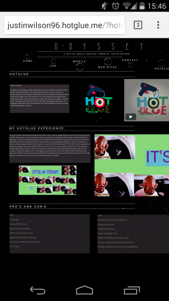
HOTGLUE
WEB SITE PROJECT: ODYSSEY
LOG
HOME
Another issue I ran into when viewing my site was not only the alignment of content on mobile devices but also on different web browsers. As shown in the images opposite the content is displayed correctly in Mozilla Firefox which is the browser I predominately used to create the site. However in both Internet Explorer and Google Chrome browsers I encounter the same issue as on mobile where all of the content is aligned the right of the page removing the 'margin' I used. Therefore to overcome this issue I will have to ensure when presenting my site I use Firefox to ensure that all the content gets displayed as intended.
Screen resolutions were also another factor that affected my pages design. I found on my monitors at home both of which are 1920x1080 the layout of content is as desired. However when using Firefox and viewing my website on other monitors with a lower resolution the alignment is yet again put out. This effect can be seen in the screenshots opposite.
I have found out that the cause of this problem is due to all content being set with a position of absolute. This means that no matter the screen size or resolution all the content is trying to be glued together which is causing the alignment issues. A potential fix for this issue is to adjust the magnification of the web page using the browser settings, but this also causes some text box content to then be overflow its 'box'. Therefore as an overall note, next time I would ensure my design was based around this fact and I would avoid creating a centrally aligned site layout/structure.
THE ALIGNMENT GAME:
BROWSERS AND RESOLUTIONS


One of the biggest issues I have encountered whilst making this portfolio on hot glue has been aligning the content on my page. Due to my layout being center aligned this has caused all manner of issues as in hot glue you have to align items by eye. Therefore on several occasions after arranging content on pages I have stood back and realized it is not aligned properly causing me to then re model each page in order to get them all to look the same.
One of the biggest problems has come with my line breaks. I created these originally using a text box and then holding down the underscore character to create lines I could use to separate content. However when either viewing my site on a different computer or on a device these bars would be completely out of alignment as you can see in the opposite screenshot taken on my Nexus 5 Android Phone.
Therefore I had to think of an alternative way to fix this problem. The way I did this was to simply create an image in Photoshop that was exactly the same as the line break text boxes. I simply created a text box on a transparent background and then pressed the underscore character until I had a long enough line. I then saved the image as a PNG. After then removing all the lines on my site I had to add the new image files in there place and I have found this has fixed my problem.
However another problem that occurs that I have yet to fix is that sometimes all my content is pressed up against the right hand side of the browser or screen. Again I think this could have been avoided if my design was not based on being centrally aligned. Many of the other designs I have seen base their structure on being left aligned meaning they do not encounter this problem. But seeing as I require 'margins' or space along either side of my content it does mean my website cannot be viewed as I wish on some occasions and I am not sure what is causing it either resolution, screen size or browsers.
Text Box Divider Alignment
New Divider Image Alignment
Right Side
Alignment Issue
Intended View - Firefox 24" 1920*1080
View - IE 24" 1920*1080
View - Chrome 24" 1920*1080
View - Firefox 22" 1920*1080
View - IE 22" 1920*1080
Laptop View - Firefox 1366*768 - 100%
Laptop View - Firefox 1366*768 - 67% Zoom
Correct Aligment but overflowing content